What will happen if I click that button?

When people know what will happen next, they are more likely to go along for the ride.

I don’t like to get in a car and randomly drive. I don’t necessarily need to know exactly where I’m going: it could just be “let’s see what’s up this road.”

When people know what will happen next, they are more likely to go along for the ride.

I don’t like to get in a car and randomly drive. I don’t necessarily need to know exactly where I’m going: it could just be “let’s see what’s up this road.”

But if you’re giving me directions, you better tell me where the end point is.
If all I have is “turn right here, then turn left there” I’ll have a very hard time following along. It’s just the way my brain works.

It’s similar with Call to Action buttons.

I want to know what will happen if I click.

  • Will my credit card be automatically charged?
  • Do I have another chance to review my order?
  • Will this link open in a new tab?
  • Will it download a PDF or a Word document?

CTA a single command, an action word.

Click this and that will happen.
Tell me what I’ll get for sharing my contact information.

  1. Write a title/tag line in big letters: What is the purpose of the button?
  2. Then show the button — which should be big and obvious and in a color used specifically for buttons.
  3. And then a short explanation of what will happen next, or what you’ll get if you click the button.

Check out this great article and infographic at DigitalInformationWorld.com about using CTAs.

Want help figuring out your best Call to Action

Head over to my contact page…
even if you’re not sure what your questions are.

Dealing with spam in email and comments

What’s the deal on marking email as SPAM? What are my options for all the crap?

Don’t waste your energy on spam in email

Recently I read a note from a colleague giving advice to others in the field.
They said:

Never Unsubscribe from an email. You are just telling the spammer they got a “live” one.

I get phone calls almost daily from different phone numbers wanting to help me with my STUDENT DEBT. I am 65 YEARS OLD! I don’t have student debt! But if/when I block one phone number I just get another call from a different number. What’s the point?  Just hang up.

So on one hand, I get it.

On the other hand, if you do just hit the spam button in your email manager, it’s a black mark on the sender’s bulk mailer. And what if the list is something you once were interested in, but don’t remember anymore signing up for?  That’s not fair.

So always try to subscribe using the unsubscribe link. Because that’s the right thing to do.

HOWEVER, if an email requires ME to supply the address to get removed.. THAT’S a spam phisher!

The second piece of advice that was passed along as a great truth(?):

If they are getting your email address off your website, you as the domain administrator can block email addresses or IP addresses from sending email to your domain.

FIRST, if you’re getting email spam that you want to block, it’s likely by the time you actually do get to an address or IP, the sender has another one in line. (See my rant above.)

So, NEVER HAVE your email address on your website unless you want trouble

But you say, you’re a business. You want people to find you.  There has to be a way.  There is!

Use a contact form

You get 2 things from a form.

  1. No robots can vacuum up your contact info
  2. And, more importantly, EVERY email from your website will have the SAME SUBJECT line. So you always know what it is.

Comment spam on a website is a different problem

  1. If nobody legit ever comments on your comments, your could just turn off comments.
  2. Or if you want to keep trying, then use some kind of plugin for your website.

Captcha works pretty well with all the websites I’ve seen. (That’s those little games you have to play to get to the real content of a site.  Personally, I HATE them.) They always say, “Prove you’re not a robot.” Why not say, “Prove you ARE human”?

Consider a “honey pot” field.  You might need help with that, but it’s a box that is invisible to visitors. But visible to robots.  So if it’s checked, it means a robot did it. So “BUZZZZ…Thank you for playing our game.”  You are spam!  And the comment doesn’t get through.

WordPress has several good plugin options. Akismet works great. It’s cheap but not free. I’ve used Antispam Bee pretty successfully. Or search for “top comment anti-spam”. You’ll find lots of options.

Finally: NEVER USE ONE OF THOSE REPLY-IF-YOU’RE-A-REAL-PERSON things.

Especially if YOU ask ME for info.

Get a clean email address. Be careful with it. (See everything I’ve written above.)

Use Gmail or a mail provider with a good spam filter in it. (BTW, your email address should be @your-business-name.com)

But, for goodness sake, don’t ask me to confirm who *I* am if you’ve written and asked my advice!

OR WORSE: You’ve got some nerve showing your your email address on your website meaning you WANT me to write to you…  And then you ask if I’m real?
SHEESH!

SO.. Do the right thing.

  1. Use SPAM notification responsibly.
  2. Use a contact form.
  3. Manage comment spam.
  4. Have your business address @your-own-business.com (Of course you know I mean you should replace that last part appropriately, right?)

And
Thanks for the opportunity to rant.

Photo by NeONBRAND on Unsplash

Easy SEO: A Brilliant Article

Advice to help your readers comprehend what you’re talking about AND help the search engines who help them, use these really simple tips.

crown on kid by parentsPeople often ask for help with SEO.

Short of paying for Pay Per Click (which I can help with), there is a lot you can do with your own content to help search engines “like” your content.

I have said repeatedly: to help your readers comprehend what you’re talking about AND to help the search engines who help them:

  • Use headlines
  • Use bold for important words
  • Use bullets
  • Say where you’re clients are (ADHD coach in Doylestown, for example)

Those few tips put my old website at number one in appropriate Google search results for more than ten years PLUS at least five more years AFTER  I was no longer providing that service!

Here is a brilliant example of what I’m talking about

The silent tragedy affecting today’s children
Even if you have no children, or don’t care about children, or the future, or anything else. Just look at the article for like 10 seconds.
Why?
Scanability (If that’s even a word)
(You have to go look.)

I’ll even presume you don’t care about the subject.

What do you see, even if you aren’t really reading?

I’m guessing:

  • This headline:
    • What to do about it?
  • Then the red bullets (which should be bold instead of red, IMHO)
    • Our children are in a devastating emotional state!
  • Then there are more bullets
  • And bold words
  • And another heading:
    • How to fix it?

That is just BRILLIANT. Readers get the idea REALLY fast .. even if they don’t care. That’s what you’re aiming for (the “getting it” part, not the “don’t care” part).

People don’t read the internet like a beloved novel.

They scan… fast. Then move on.

So you need your readers to get the content ASAP.
Make it easy for them. Use:

  • Headlines
  • Bullets
  • Bold
  • Short sentences
  • Easy reading

PS: That article has really good parenting advice.

Search Engine Optimization Before Yoast

When you use SEO plugins you have to go back and correct stuff. Get the tips for where to use your keywords in place first.

SEO plugins are a great help when you’re trying to compose new content for your website.

They let you know, among a lot of thing:

  • if there’s not enough content, or
  • if you didn’t use keywords in the right places, or
  • if your title is too long or too short, or
  • if the language is too complicated for most readers.

The problem is using them means you have to go back and correct stuff that might have been easier to have put in in the first place.

This presentation from WordCamp Rhode Island 2016 gives you tips for places to use your keywords before you check your work.

Here’s the link to WordPress.tv recording of my talk.

Hey, Keurig! Where does the water go?

Using your phone, search Keruig.com for “Where does the water go?” The reply will certainly surprise you.

We have a small size Kuerig coffee maker.keurig coffee maker

Don’t hate me, we use refillable cups. Originally it seemed we’d use less coffee as compared to  making a full pot and tossing half. (I’m not sure that’s true… nevertheless. My sister gave it to me. And we use it.)

Recently we find that when you fill the reservoir with a full cup of water, you only get a half cup of coffee.  If you add a little MORE water to fill the cup, it generally overflows at least some.

So this morning I thought I’d look at Keurig’s website to see if they might offer some support.

I was at the kitchen table. I used my phone.
keurig search
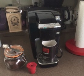
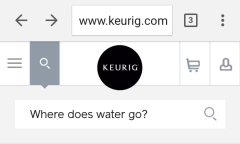
First I tried SUPPORT which, to Keurig, means how to cancel your order. You can’t. Returning is very specifically outlined.

So I thought I’d use the search function.
I carefully TYPED in: “Where does the water go?”

Answer could have been, “In the top, you idiot.”

keurig answer
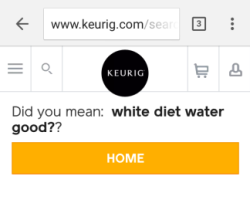
But no, instead the answer is:

Did you mean: white diet water good??

I kid you not. I did not SPEAK my request. I typed it.
Did it again to be sure.  Got the same answer.

Really? All of my words were spelled right and simple enough for a 3-year old to understand.

My big machine had a different answer:

We couldn’t find “where does the water go”
But with 400 varieties of beverages we are sure you’ll find something to love on our site.

Clearly Keurig has a much different site for mobile than for desktop viewing.

Why is this a lesson?

First, the good thing:  Keurig wants visitors to have a good view of their products. So they have a special set up for mobile users. Something like 54% of visitors to a site are mobile visitors. For sure, more than half web users use mobile devices.

Second, the other thing: Keurig mobile and full size sites clearly are not the same. I know they can’t LOOK the same because, well, the screen on mobile devices is smaller. But they could at least have the same search results!

I thought I’d check on responsinator.com to see what that service showed. It’s a great place to check to see what your site looks like on different devices without actually spending all the money to have them all. Guess what? Responsinator.com showed NOTHING. Blank screens for every size device.

I’m not sure what that means.  But I know that for my client sites I want to see SOMETHING there. It might not always be exactly right. But it’s sure closer than BLANK!

Look, this is important

  1. Mobile is here to stay.
    People are less and less tolerant of sites they have to pinch and stretch.
  2. Test your site on more than the browser you use. (Or insist that your developer does). Once upon a time there may have been only two browsers. But now there are LOTS AND LOTS of people who use something different than you. If you use IE and your own site doesn’t look right, get somebody to fix that. It’s possible (almost all the time).

Why the rant?

  1. If you want people to use your site, make it easy for them to do it.
  2. If you want to SELL them something, make sure they can find it. (That means linking directly to the page you want them to look at… Ah, and that’s a rant for another day.)
  3. Any question that you are often asked, or something you think MIGHT be often asked, put those questions and answers on a Frequently Asked Questions (FAQ) page.

If somebody found a page, they must be at least curious about what’s on it. Help them feed their curiosity.

With props and apologies to Bonnie Raitt, “Give ’em something to [think] about.”

Don’t make ’em mad and kiss them good bye!


Writing enough content and why it matters

You do know that Google can’t actually READ anything.
It’s a computer. It just picks out words for search results.

It also says that topics require at least 300 words to have “authority.”

So if you have less than 300 words on a page, then you’re not telling Google that subject matter is important.

The Great Google says you need at least 300 words on a page

Do you want to mess with the Great Google?

You do know that Google can’t actually READ anything.
It’s a computer. It just picks out words for search results.

It also says that topics require at least 300 words to have “authority.”

So if you have less than 300 words on a page, then you’re not telling Google that subject matter is important.

In Naomi Dunford’s newsletter today, she wrote: A Little Copywriting Advice: Sometimes, You Just Gotta Fill Space

Here’s what I really like about all of her letters:

  • They have big type and lots of white space. (It looks almost the same on her website.)
  • There are generally not a lot of pictures to distract me. Yes, I know that’s counter to everything you read about marketing. But clearly it works for some people in some instances.
  • The letter is fun, really more like a letter from a friend and less like a marketing piece.
    There’s always a good story.

People identify with and remember stories!

My regular advice to my kids, long ago, was this:
“No matter what happens, if you get a good story out of it, you’re good to go!”

Naomi’s story is always something that makes me like HER.
I want to have a drink with her, or have her stay over here. I’d even like to meet her son, Jack who I think is about 5 now. (I remember when he was born!)  And I do NOT even like little kids.

What does this have to do with your website?

In my opinion, your website is for three things. You want people to Know, Like and Trust you. It pretty much has to be in that order.

  1. Let people KNOW, at least, what you look like. If you’re going to meet in person, it’s nice to have an idea of just who you’re looking for in the mall. And it’s nice to know that the person you’re thinking of hiring shares somethings in common with you.
  2. Share something about yourself so that people will LIKE you. Let visitors to your site know something about your history, or what made you decide to do what you do. Stories are great for that.
  3. Share information that proves you know something about what you want to talk about, so people can TRUST you. It’s not necessary to always cite studies and famous people, but it’s also not necessary to dumb down your content.    If you like working with “heady” then write for them. Just the same as if you like working with moms, or artists, or engineers, write for them.

No matter what the service you provide, coach, organizer, web developer, undertaker:
People won’t like you if they don’t know you. Rarely do you trust someone you don’t like.

So think about your visitors when you’re writing your content.

This may be sacrilege: but sometimes the website is just an introduction. It’s not always to keep people coming back for more.

Personally, if I can get thru the know-like-trust thing in a single visit, and that results in a call or an email, I’m ecstatic!

It doesn’t often happen. People do take time to make decisions.

Just remember, it’s just not necessarily the fact that you’ve got an MBA from Harvard that gets you the sale.

If they like you, if they connect with you and then they’ll keep reading what you post.
That’s a good reason to keep adding content.

After a while, they’ll call or write or buy something.

Oh, and by they way… If you’re nice!  Show that.

Here’s a question:  How do you  know if you’ve connected with someone?

Photo credit: Sgarton from morguefile.com

Signature Files:
Still the best free advertising available

Thirty years ago when I got my first business cards for my first business, I thought it was the best $20 I ever spent. It made me feel professional and assured that whoever got my card had all the pertinent information about me and what I was selling.

That’s still true, but now even more important is your signature at the end of your email.

I wrote this article for Circle, the monthly publication of the ADHD Coaches Organization in 2006… almost 10 years ago! I’ve updated the article a bit, but none of the basic information has changed! And yet, I regularly get email from people who want to be in contact with me that does not include even simple contact information at the end.

Signature Files: Better than business cards

Thirty years ago when I got my first business cards for my first business, I thought it was the best $20 I ever spent. It made me feel professional and assured that whoever got my card had all the pertinent information about me and what I was selling.

That’s still true, but now even more important is your signature at the end of your email.

It’s advertising that is allowed by all but the strictest of email groups or message boards. It often remains attached to your emails—even when they are passed further—and that’s marketing!

The signature file, also called a sig file, comes after your closing on every email even the ones you forward on.

It should contain at least

  • your full name with appropriate credentials
  • your phone number
  • your business name
  • your web site address (This is particularly important if your email address is not @yourdomain.com! I’m not sure why a business person would use any address that is NOT @yourdomain.com. But I guess a lot of people think that AOL or GMAIL need your free advertising.)
  • I also include my street address and my email address—just in case the body of my email is detached from the header (the top part of an email that includes the to/from info).

Your sig file should NOT include your whole resume!

It should not be more than about seven to ten lines long.

I’ve seen emails with 40 lines of signature… including links! CRAZY for sure. Do you really think anybody is going to look at that stuff? Much less read it? If you do, I have a bridge you might be interested in.

And you know what, email with too many links regularly gets called spam by email managers. It’s particularly a problem if you post in YahooGroups.

Don’t be tempted to leave out the phone number.

In a 2005 column (updated in 2014) on the website Poynter.org, a website for journalists, one of the top ten beefs was emailed press releases with no contact phone numbers. You sure don’t want to mess up a contact with the press.

You also don’t want to delay prospective client who just prefers real conversation.

And if you want me to call you, don’t presume I can find your number in the scraps of paper on MY desk!

More than one sig file

Store more than one sig file in your mail manager (Outlook, Gmail, AOL or what ever program you use to view your mail). I have several:

  • A standard default one that includes everything I mentioned above
  • One each that refers my role as webmaster for several different organizations. They might include links to schedules and/or directions and appropriate disclaimers

I can choose to use none. But that must be a conscious decision.

I’m sure you’ve seen emails with standard disclaimers like:

  • If this wasn’t for you, eat it and don’t tell anyone you saw it … or
  • This is confidential, don’t show it to anybody

But recently I saw this extra line at the end of an email from SXSW:

This email is: [ ] bloggable [x] ask first [ ] private

Seems like a really good idea!

PS: If you think you might be too big or too busy to be bothered with a sig file

Check out the website of the Fayette County Public Schools in Lexington, KY. They have a great technology site.

You’ll find simple instructions of how they show kids in grade K-12 to set up sig files using Outlook. Their list of what should be included is a bit shorter than mine, but not much. And their information is for kids!

Do you have other things about signature files that bug you? Let me know about it in the comments below.

Photo credit: cohdra from morguefile.com

Spell Checking Horrors!

When is “from” the right word? When is “form” the right one? Can a computer really be depended upon to use the right one in the right place?
Read Lingofy reviews

Lingofy Reviews

Spell checking is the bane of existence for many writers and posters.

When is “from” the right word? When is “form” the right one? Can a computer really be depended upon to use the right one in the right place?

LingofyRecently I stumbled across Lingofy. It’s an extension for Chrome and Safari and an installed program for PCs and MAC.

I signed up for a free version using American English (The only other choice appears to be Norwegian!) They also have paid version that will check using APA style guides. Pretty sweet if you’re applying to medical-type publications.

I installed both the desktop and the Chrome version. So far, so good!

I tested the desktop version using Word. The installed program shows up in the FILE | HOME | etc. ribbon at the top of the page.

In Chrome, it has its own little  icon. They say it works in lots of online programs. I tested it using WordPress.

After you click the button to Lingofy, a window pops up to say what it’s doing.

It finds the usual spelling errors. The results show suggestions which you can accept or decline.

It tracks the number of times you use the same word, which is nice if you didn’t realize how many times you use the word “authentic”… it can help your writing be a bit more polished.  It offers suggestions for replacement words.

(PS: Studies show that using big words for the sake of using big words does NOT make you appear smarter!)

Some words you’ll probably want to choose to list in your personal style guide (part of the program). List the words you use consistently one way or the other:

  • website or web site?
  • Internet or internet?
  • Email or E-mail?

Lingofy does take a little bit to figure out how to accept the suggestions. But once you notice the little check boxes, it’s a big DUH!  Make changes in the right hand column, check the boxes and hit ACCEPT. BAM! You’re done.

My Review of Lingofy:

Lingofy is in Beta. So some issues are to be expected.

I used Lingofy in Word on a couple of short documents. Seemed to be ok. (Although it missed that this sentence originally started with “I uses”)

I tested it on a long contract and it went through that with no trouble.

But when I tried to use it on the same document a couple of times, sometimes it seemed unreasonably slow and then hung the program. Same thing happened in WordPress.

The biggest issue, however, is that Lingofy runs in a popup light box window. That means the content you’re testing is grayed out. It’s difficult to see just where the program is suggesting a change. You can drag the popup around, but it’s not
always entirely perfect.

My recommendation:

Don’t run the program on any file you don’t have a backup of someplace. It could be a second Word document or a NotePad copy of WordPress post.

Once it hung up in Chrome, the only way to get it unstuck was to close the page. Once it hungup in Word, it really hosed the page. Without a backup, I’d have been really PEEVED!

Google hates “coming soon”

Let’s say you want to bake a cake and you find you are out of eggs.

You go to the grocery store to buy some and find a sign that says “Eggs: coming soon!”

You look around the store manager to ask, “What does this mean ‘coming soon’?”

He says, “Well, they’re on a truck.. that’s coming soon. We don’t know exactly when. But ..soon. So you should check back again … soon.”

And I know you hate “Coming Soon,” too!

How do I know?
Here’s a story:

egg crate with coming soon
Let’s say you want to bake a cake and you find you are out of eggs.

You go to the grocery store to buy some and find a sign that says “Eggs: coming soon!”

You look around the store manager to ask, “What does this mean ‘coming soon’?”

He says, “Well, they’re on a truck.. that’s coming soon. We don’t know exactly when. But ..soon. So you should check back again … soon.”

Ridiculous, right?

How many times will you go back to that store? (It would make me really angry and I’d vow to never shop there again.)

Search engines are designed to help searchers find the best content relative to the search terms.

So when their magic robots scan your content, they can pretty easily tell if it says “coming soon” or “under construction.”

Here is a sad example I recently found on an established website with a new front page:

A new website is coming soon…
in the meantime, this site is temporarily unavailable.
We apologize for any inconvenience.

However, the MEMBERS AREA can still be accessed during
construction and testing of the new site…
CLICK HERE to go there now.

That’s just 41 words and pretty much none of it yields any indication of authority on any subject.

That is particularly sad because when searching for an obvious specific keyword, the site had been number one in Google for MANY years.

I can’t say that their ship is sinking fast. But it sure is pissing off people who want to find information that should be obvious there. It should also be angering members who rely on a directory to find business.

Google expects at least 300 words on a page to even consider that there is relevant information available there.

Everything on the internet can change pretty easily. So how about instead of “under construction,” you scrape together 300 words about your business or site.

A sentence or two including:

  • The name of your company and contact information
  • Your own name, a picture with appropriate “alt tags
  • What your company does and who it serves

If Google finds your “coming soon” banner during its indexing more than a couple of times, your traffic will suffer. And it may be very hard to get that ranking back.