
We have a small size Kuerig coffee maker.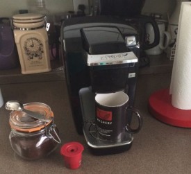
Don’t hate me, we use refillable cups. Originally it seemed we’d use less coffee as compared to making a full pot and tossing half. (I’m not sure that’s true… nevertheless. My sister gave it to me. And we use it.)
Recently we find that when you fill the reservoir with a full cup of water, you only get a half cup of coffee. If you add a little MORE water to fill the cup, it generally overflows at least some.
So this morning I thought I’d look at Keurig’s website to see if they might offer some support.
I was at the kitchen table. I used my phone.
 First I tried SUPPORT which, to Keurig, means how to cancel your order. You can’t. Returning is very specifically outlined.
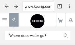
So I thought I’d use the search function.
I carefully TYPED in: “Where does the water go?”
Answer could have been, “In the top, you idiot.”
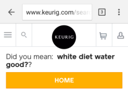 But no, instead the answer is:
Did you mean: white diet water good??
I kid you not. I did not SPEAK my request. I typed it.
Did it again to be sure. Got the same answer.
Really? All of my words were spelled right and simple enough for a 3-year old to understand.
My big machine had a different answer:
We couldn’t find “where does the water go”
But with 400 varieties of beverages we are sure you’ll find something to love on our site.
Clearly Keurig has a much different site for mobile than for desktop viewing.
Why is this a lesson?
First, the good thing: Keurig wants visitors to have a good view of their products. So they have a special set up for mobile users. Something like 54% of visitors to a site are mobile visitors. For sure, more than half web users use mobile devices.
Second, the other thing: Keurig mobile and full size sites clearly are not the same. I know they can’t LOOK the same because, well, the screen on mobile devices is smaller. But they could at least have the same search results!
I thought I’d check on responsinator.com to see what that service showed. It’s a great place to check to see what your site looks like on different devices without actually spending all the money to have them all. Guess what? Responsinator.com showed NOTHING. Blank screens for every size device.
I’m not sure what that means. But I know that for my client sites I want to see SOMETHING there. It might not always be exactly right. But it’s sure closer than BLANK!
Look, this is important
- Mobile is here to stay.
People are less and less tolerant of sites they have to pinch and stretch. - Test your site on more than the browser you use. (Or insist that your developer does). Once upon a time there may have been only two browsers. But now there are LOTS AND LOTS of people who use something different than you. If you use IE and your own site doesn’t look right, get somebody to fix that. It’s possible (almost all the time).
Why the rant?
- If you want people to use your site, make it easy for them to do it.
- If you want to SELL them something, make sure they can find it. (That means linking directly to the page you want them to look at… Ah, and that’s a rant for another day.)
- Any question that you are often asked, or something you think MIGHT be often asked, put those questions and answers on a Frequently Asked Questions (FAQ) page.
If somebody found a page, they must be at least curious about what’s on it. Help them feed their curiosity.
With props and apologies to Bonnie Raitt, “Give ’em something to [think] about.”
Don’t make ’em mad and kiss them good bye!